Industrial screens for hands in gloves
Redesigning the real-time control and monitoring screens for baggage handling at Copenhagen Airport. Touch kiosks, large info displays, and a dark mode analysis built on human-factors evidence.
- Problem
- Handlers run real-time offloading on shared, glove-operated kiosks, where a mode mismatch can cause safety-critical failures.
- Role
- Sole product designer for the full screen system: the 20" control kiosk, the 55" info display, and the action panel.
- Outcome
- Independently validated by a third-party research firm across two rounds, scoring 4.2 to 4.6 on core tasks, with handlers reporting it made mistakes harder to make.

Role
Product Designer
Timeline
2025 to 2026
Company
Bagstage
Client
Copenhagen Airport
The xEU system is the real-time control and monitoring interface for baggage handling at Copenhagen Airport (CPH). Handlers use it to register first bag, last bag, switch between Local and Transfer modes, handle errors, and coordinate across belts.
The system needed to support new operational needs: multi-mode offloading, mode mismatch detection, and real-time status visibility for teams working across multiple belts.
I designed the full screen system: the touch-based control kiosk (20", tilted), the large info screen (55", ceiling-mounted), and the action panel for advanced operations. I then commissioned EyeReply, an independent third-party UX research firm, to validate the designs with real handlers.
The Users
Baggage handlers. Physically active, on their feet, often wearing gloves. Their attention is split between the belt, the bags, and the screen. Interactions are brief and repeated: glance, tap, confirm, back to the belt. Up to 50–100 new staff onboard per year.
Walk-up kiosk
No fixed operator. Anyone approaches, does the task, walks away.
Gloves & distance
Large touch targets. Info screen readable from meters away.
Under 10 seconds
Glance-based use, not sustained reading. Brief, repeated interaction.
Safety-adjacent
Mode mismatch can cause operational failures. Error states must dominate instantly.
Fig. 01 Control Screen
The baggage handler’s primary tool
A 20" touch kiosk (tilted) where handlers manage the offloading process: start routes, register first and last bag, switch modes, handle mismatches, and move flights between belts.
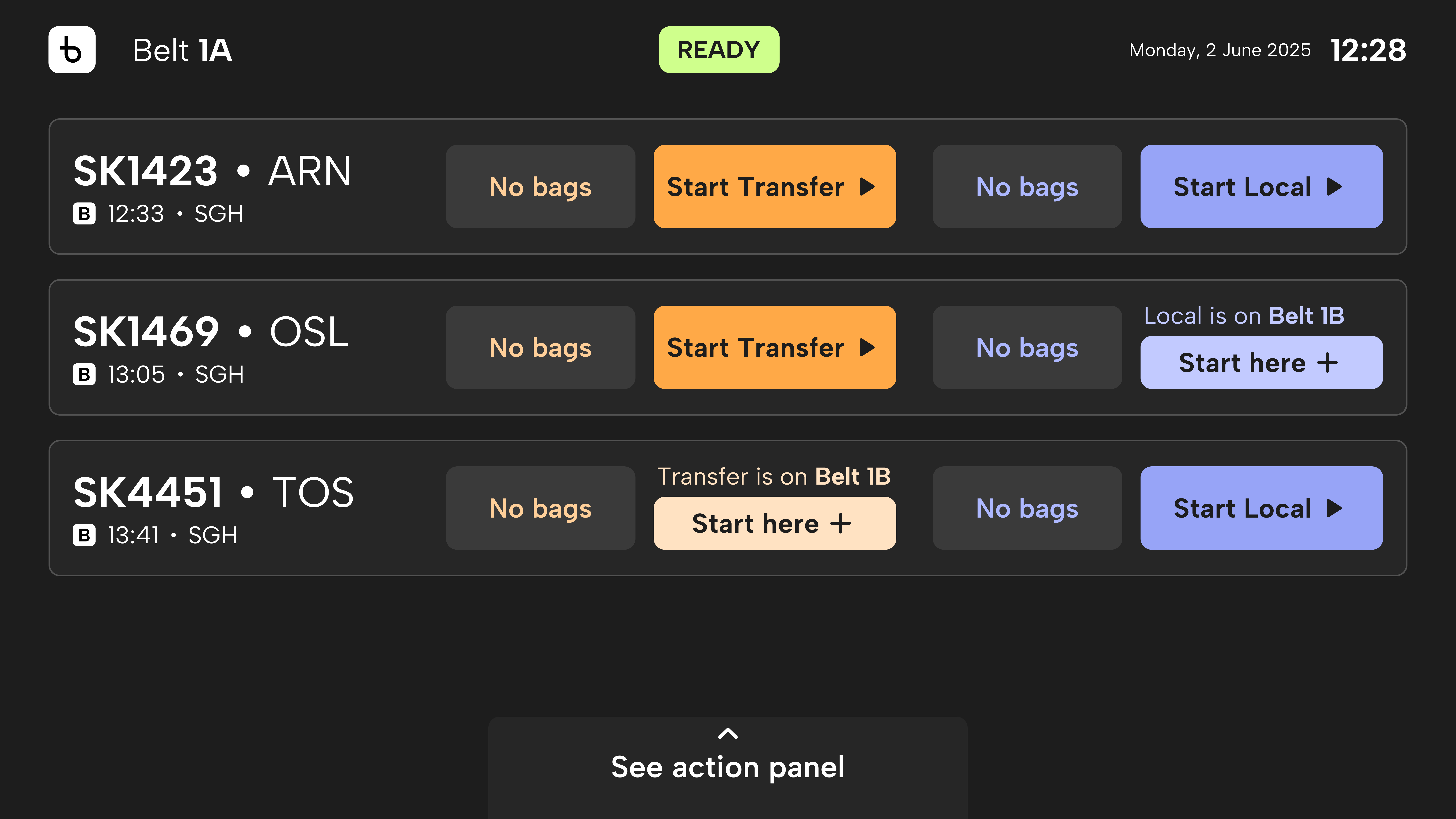
Designing for gloves and unreliable touch. Work gloves roughly double the contact area of a fingertip, so every target had to be sized for that reduced precision. Size alone wasn’t enough: the touchscreens have unreliable sensitivity, creating a real risk of double-taps. So “Start” and “Finish” never share a position. After “Start,” a running-bags animation replaces the button, and because it isn’t interactive, a stray second tap does nothing. The layout prevents the error instead of trying to catch it.
The key decision: showing two modes on one screen. I built and tested two approaches. One shows Local and Transfer side by side with the inactive mode locked. The other shows only the active mode. Seven handlers tested both, and five preferred seeing both modes for the context and fewer mis-clicks. The single-mode view was praised as clearer for new staff, but adds a step when switching.
Mode mismatch recovery. When Transfer bags land on a belt set to Local (or vice versa), the system stops and guides recovery: the belt auto-stops and a dialog names the mismatch (“You started Local, bags scanned for Transfer”). Testing validated the flow but changed the confirmation wording from “Confirm” to “I checked the bags”, the action the handler actually performs.
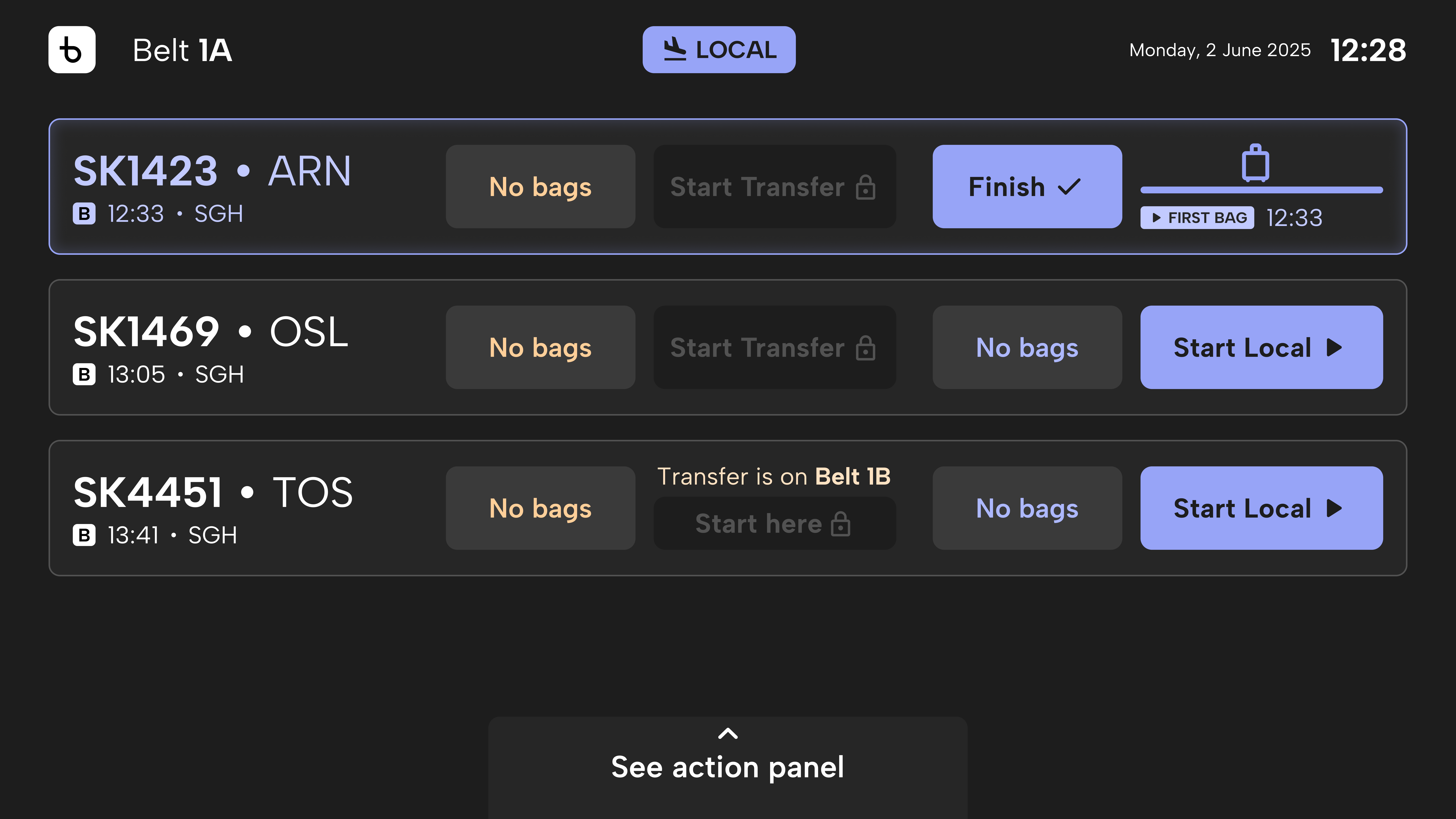
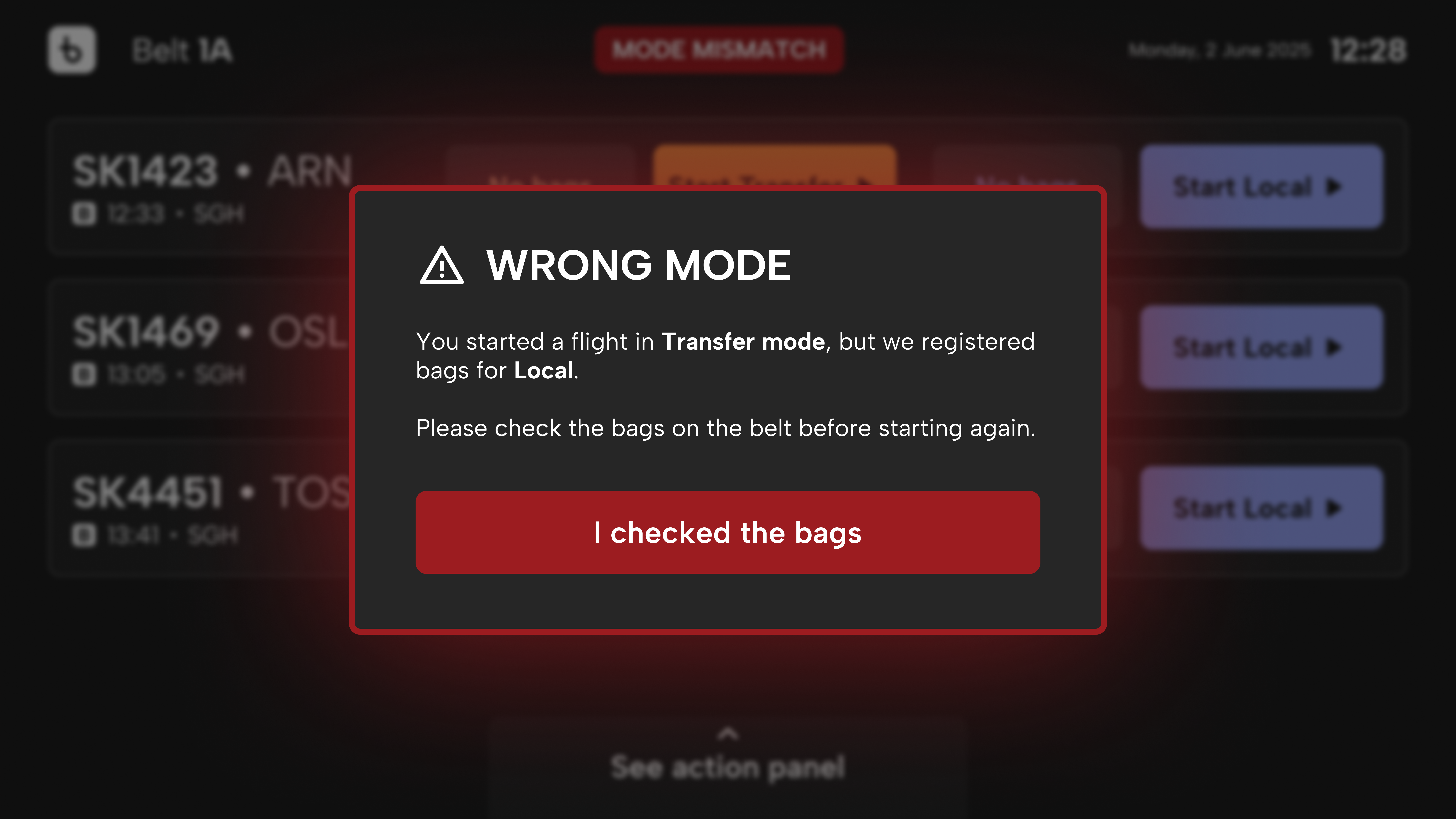
Fig. 02 Info Screen
Shared team awareness at 55 inches
A large ceiling-mounted display visible from several meters away, showing the whole team what’s happening: which mode is active, which routes are running, what’s coming next, and critically, when to stop loading.
The design principle: one-glance safety. The “Do not load” state must dominate the entire screen. When a handler walks up to a belt, they need to know in under two seconds whether they can load bags or not. Distance readability. Belt ID was initially too small. Time notation (“-5 min”) was ambiguous. I redesigned with larger belt identification, wrote out time as “Estimated first bag in 5 min”, and added “Time from block” with color feedback.
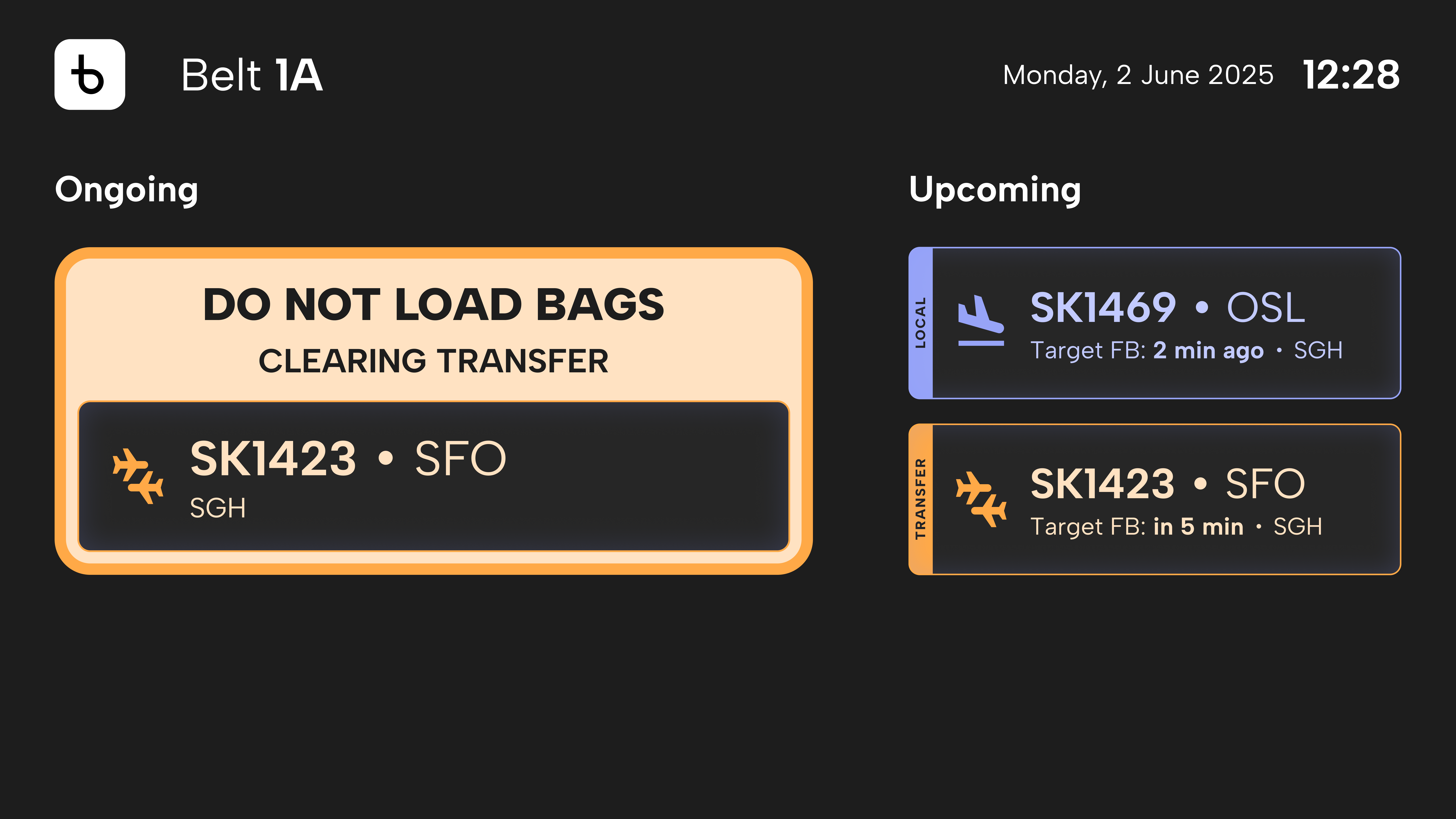
Fig. 03 Action Panel
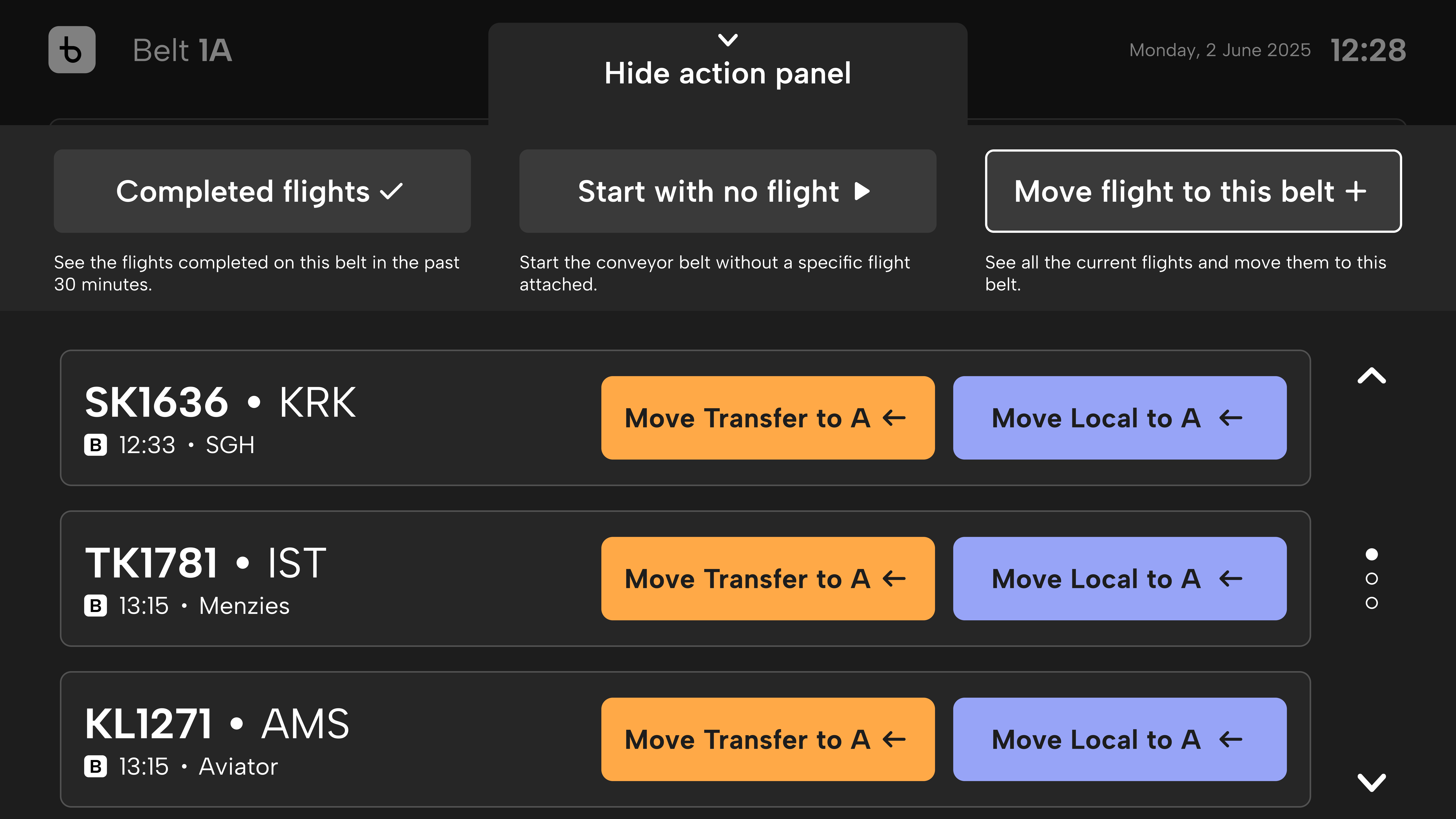
Advanced operations, one swipe away
An expandable panel on the control kiosk for less frequent tasks: viewing completed flights (for found baggage), starting a belt with no flight assigned, and moving flights between belts.
The “Move” problem. This was the single biggest comprehension risk across all testing. “Move & start” and “Transfer on 1B” were repeatedly read as moving away from the belt, when the intent was moving to it. Handlers expected directional language and visual cues. The fix: explicit “from → to” wording with arrows, and presenting the move action in a layout consistent with the main route list.
When stakeholders need evidence, not intuition
Stakeholders weren’t convinced dark mode was right for industrial kiosk interfaces. A fair concern: most HMI literature recommends light backgrounds for readability. I wrote a formal analysis grounded in human-factors research and measured luminance data to reframe the question.
The core argument: the xEU system is not a reading interface. It’s a monitoring interface. The performance objectives are different.
Reading-Optimized
Prioritizes letter acuity, sustained reading comfort, and light backgrounds. Office software, documents, data entry. Positive display polarity is well supported by research for these tasks.
Monitoring-Optimized
Prioritizes rapid state recognition, change detection, alarm visibility, and signal-to-noise ratio. Control systems, industrial HMI, operational dashboards. Dark baselines provide more contrast headroom for alerts.
Measured Contrast vs. WCAG AAA Threshold
Normal text
12.4
: 1
AAA threshold: 7:1
+77% above
Local mode text
9.8
: 1
AAA threshold: 7:1
+40% above
Transfer mode text
8.2
: 1
AAA threshold: 7:1
+17% above
Independent testing confirmed: 8 out of 12 baggage handlers preferred dark mode. Average rating for dark: 4.0/5. Average for light: 3.75/5. The preference combined with the human-factors evidence supported dark mode as the default for operational displays.
8/12
Preferred dark
AAA
All text passes
15p
Analysis pages
Two rounds, independent validation
I designed all screens and the testing process. EyeReply, an independent UX research firm, ran the sessions and delivered findings I couldn’t dismiss as designer bias.
Round 1
November 2025
17 baggage handlers + 2 operations leads
Initial validation: control screen, info screen, mode display approaches, error handling. Established baseline preferences and identified terminology issues.
Round 2
February 2026
12 baggage handlers across all ground handling companies
Prototype test: full task scenarios including action panel, move operations, time logic, microcopy. 60-minute individual sessions.
“The solution is perceived as easy to learn, practical in day-to-day operation, and an improvement over today’s setup. Several respondents described the new setup as making it harder to make mistakes, particularly in safety-critical situations.”
EyeReply, Round 2 Conclusion
Key Usability Scores (Round 2)
Scale 1-5, where 4+ indicates a professional solution.
Reflection
Industrial UX is its own discipline
Designing for gloved hands, distance reading, shared kiosks, and changing overhead light shifts every assumption. Touch targets, contrast ratios, error visibility, microcopy length: all recalibrated for the physical world.
Evidence shifts stakeholder conversations
The dark mode analysis replaced opinion with measured evidence. Contrast ratios and human-factors citations carry more weight than design instinct.
Independent testing builds real credibility
Commissioning EyeReply as a third party meant findings couldn’t be dismissed as designer bias. When an independent firm validates the design, it lands differently in a stakeholder room.